Here a first try of the designer for the new logo of Raydium (the current one have serious problems when scalling)

This version is small and bitmap, but the original is vectorial.
Comments?
| Raydium 3D Game Engine https://memak.raydium.org/ |
|
| New raydium logo (first version) https://memak.raydium.org/viewtopic.php?f=3&t=834 |
Page 1 of 1 |
| Author: | vicentecarro [ Wed Aug 27, 2008 10:19 am ] |
| Post subject: | New raydium logo (first version) |
Here a first try of the designer for the new logo of Raydium (the current one have serious problems when scalling)
This version is small and bitmap, but the original is vectorial. Comments? |
|
| Author: | st [ Wed Aug 27, 2008 2:04 pm ] |
| Post subject: | |
Amazing! Good job, I like it! Pretty to hear that it is vector based. Pro: - Simpleness, so it is readily identifiable. - It has something to do with an engine. - Vector format. Contra: - I don't like the UPPERCASE style, personally I'd like to see "Raydium" instead of "RAYDIUM". - The text color should be equal to the original one: Red 100%, Green 80%, Blue 0%. At this preliminary result I prefer the current logo more than the new one. I'd an idea some time ago. What about a logo that it similar to the current one, but the name, slogan and "R" is a gravure in the engine e. g. like in a real car. Is it possible in vectorial mode? Here some pictures to visualize my idea:  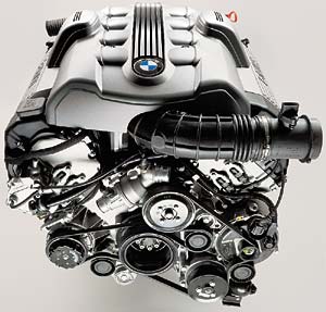 
BTW: Yes, I'm a beamer fan. |
|
| Author: | nostalgeek [ Wed Aug 27, 2008 5:14 pm ] |
| Post subject: | |
yeah, good job but, try with the text of the official logo please, i think is most in theme "mechanic" |
|
| Author: | Xfennec [ Wed Aug 27, 2008 7:20 pm ] |
| Post subject: | |
Same as the others, I like the engine part, but would prefer "Raydium" case. And I want some yellow ! |
|
| Author: | st [ Thu Oct 09, 2008 9:02 pm ] |
| Post subject: | Re: New raydium logo (first version) |
vicente wrote: ... a first try of the designer for the new logo ... When can we expect an updated or new version? Any progress so far?
|
|
| Author: | vicentecarro [ Thu Oct 09, 2008 9:38 pm ] |
| Post subject: | Re: New raydium logo (first version) |
I have remembered this matter to the designer. Soon more news. |
|
| Author: | vicentecarro [ Fri Oct 10, 2008 9:48 pm ] |
| Post subject: | Re: New raydium logo (first version) |
Here a new version. Maybe a bit too much experimental     This second version is the same but with a lightning effect. |
|
| Author: | st [ Sat Oct 11, 2008 4:53 pm ] |
| Post subject: | Re: New raydium logo (first version) |
vicente wrote: This second version is the same but with a lightning effect. Nice, I like the new version with the indicative lightning effect. You can even identify the logo in smaller resolutions, which is very important, IMHO!I've rescaled the second image to fit the current size of Raydium logo used in the Volcano demo:  Again I like the simpleness, so it is readily identifiable, that it has something to do with an engine and it's in a vector format. I really like the art of the "R" from "Raydium", which lift-off a bit from the rest of the characters. Only one thing I don't like in the new version: The slogan "game engine" doesn't fit my agenda. Everything is kind of "cel-shaded", but not the slogan. The slogan could be left-aligned, so the right side of the image ends with the "m" of "Raydium". The slogan should use another color, perhaps some gray like this:  My wish list for the slogan: Also with a very light "cel-shading", another color as used for "Raydium" and could be left-aligned, so that the slogan is more in the background and the engine name is more in the foreground. This are only my expressions, I'm not a designer, I'm only following my feelings about this new logo version. Summarized the new logo looks very clean, professional and inviting for me. |
|
| Author: | ouille [ Sun Oct 12, 2008 11:34 am ] |
| Post subject: | Re: New raydium logo (first version) |
Hello, I think that raydium readibility is not so good. There is a strange fealing about motor perspective and raydium strictly horisontal. But as i am a totaly noob on this, it's just my feeling. Have a nice day Ouille |
|
| Author: | Xfennec [ Mon Oct 13, 2008 6:58 pm ] |
| Post subject: | Re: New raydium logo (first version) |
My 2 cents: Too much details and the font a bit tricky to read. Simplicity is the best ! |
|
| Page 1 of 1 | All times are UTC |
| Powered by phpBB® Forum Software © phpBB Group http://www.phpbb.com/ |
|